MasterControl: Website Navigation Redesign
Overview
The MasterControl website navigation evolved through multiple iterations to better reflect the company's growing product offerings and improve the experience for prospective customers. As the platform matured, the navigation shifted from simply organizing content to telling a clearer product story, helping visitors quickly understand MasterControl's core solutions while creating a scalable foundation for future growth.
Role
UX Designer & Front-End Developer
Industry
Enterprise SaaS
Timeline
Multiple iterations over 2 years
Team
Marketing, Product, Design
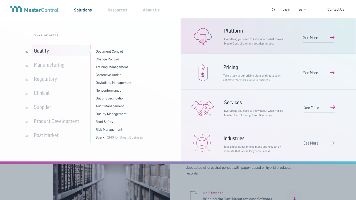
The original design
The Challenge
The existing navigation no longer reflected the company's product strategy. It featured an outdated hierarchy based on legacy product groupings, making it difficult for prospective customers to understand MasterControl's primary offerings. Important product pages were buried beneath broad solution categories, while lower-priority pages occupied valuable navigation space.
The goal was to simplify the information architecture, improve content discoverability, and create a navigation experience that clearly communicated MasterControl's two primary product lines, Quality and Manufacturing (and later Asset and Platform) while making the website easier to navigate across desktop and mobile devices.
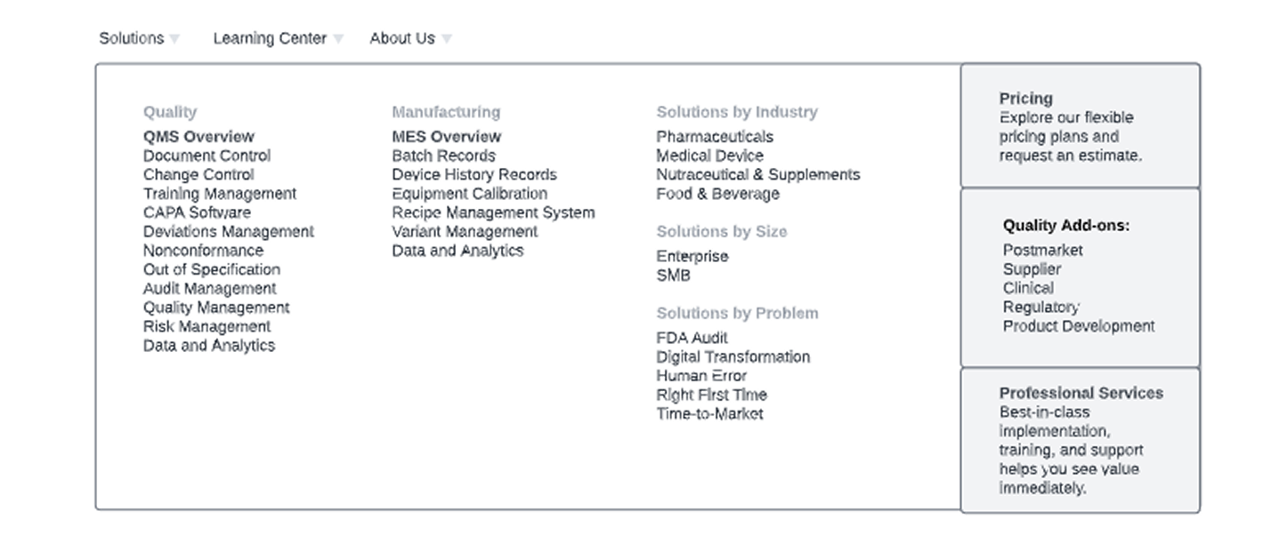
Required Links after initial Audit
My Role
I partnered closely with Marketing, Product, and fellow designers to lead the UX and front-end implementation of the navigation redesign. My responsibilities included:
- User research & content audit
- Information architecture
- User flows & wireframing
- UI design & interactive mockups
- Stakeholder presentations and feedback sessions
- HTML, CSS, and JavaScript development
- Responsive implementation and deployment
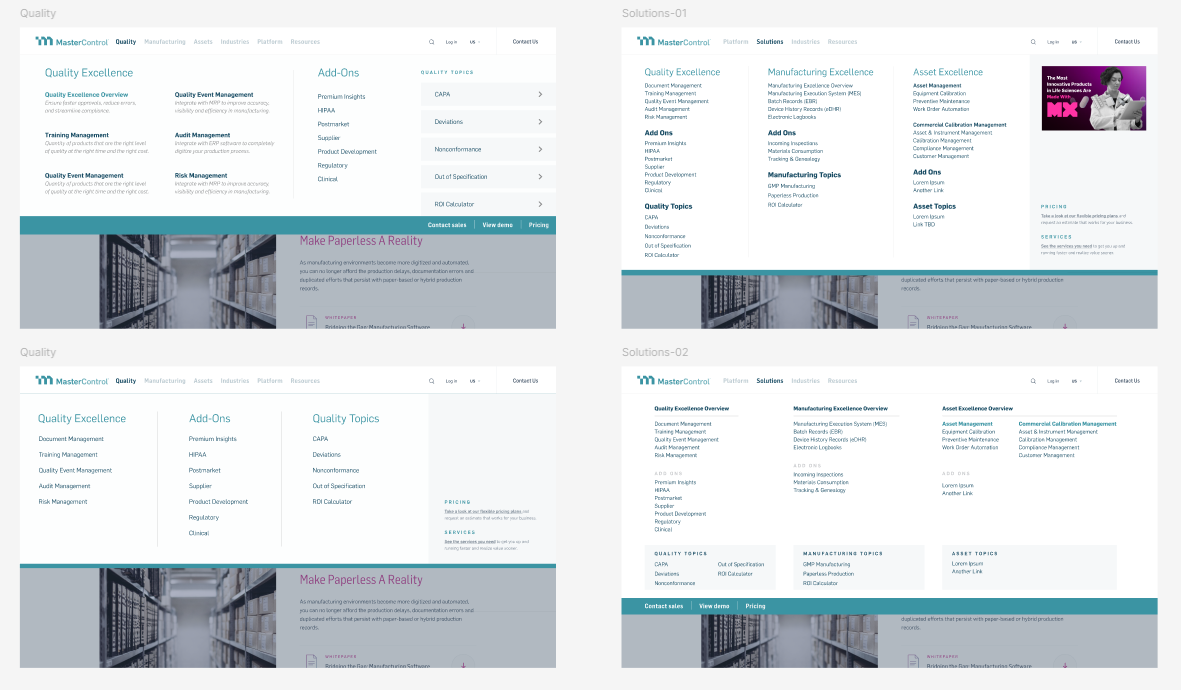
V-2.0 Initial Design Concepts
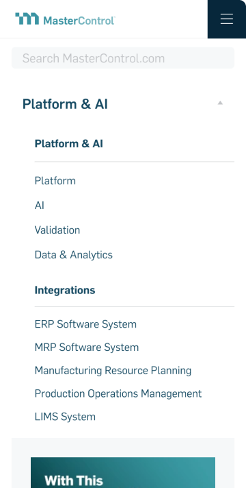
Mobile Menu Final Design
The Process
This project was highly collaborative and evolved over multiple releases. Through research, stakeholder workshops, and content audits, we restructured the site's information architecture to better align with customer needs and business goals.
The latest iteration focused on surfacing Quality and Manufacturing as primary navigation items rather than nesting them under a broader "Solutions" category. Alongside these structural improvements, I refined the responsive navigation experience and simplified the underlying front-end code, resulting in a faster, cleaner implementation that improved both usability and maintainability.
The Solution
The redesigned navigation provides a clearer path for prospective customers to explore MasterControl's products while supporting future website growth. By simplifying the hierarchy and aligning navigation with the company's product strategy, visitors can more quickly understand what MasterControl offers and navigate directly to the information most relevant to them.
The updated mobile experience also delivers a smoother, more intuitive interaction with a lighter implementation that improves overall performance. Following launch, the redesigned navigation has seen increased user engagement, providing clearer insight into which product areas visitors are exploring most.
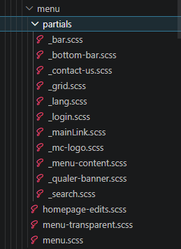
CSS Folder Structure to keep it organized
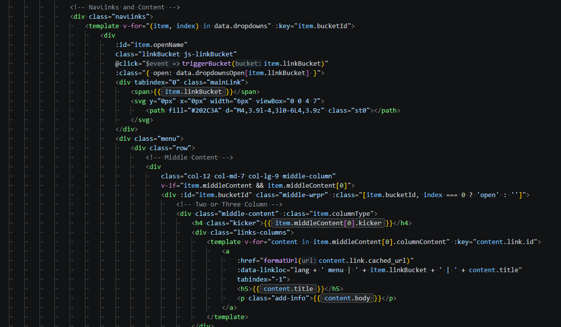
V-2.0 Built Out using Vue3
The original menu
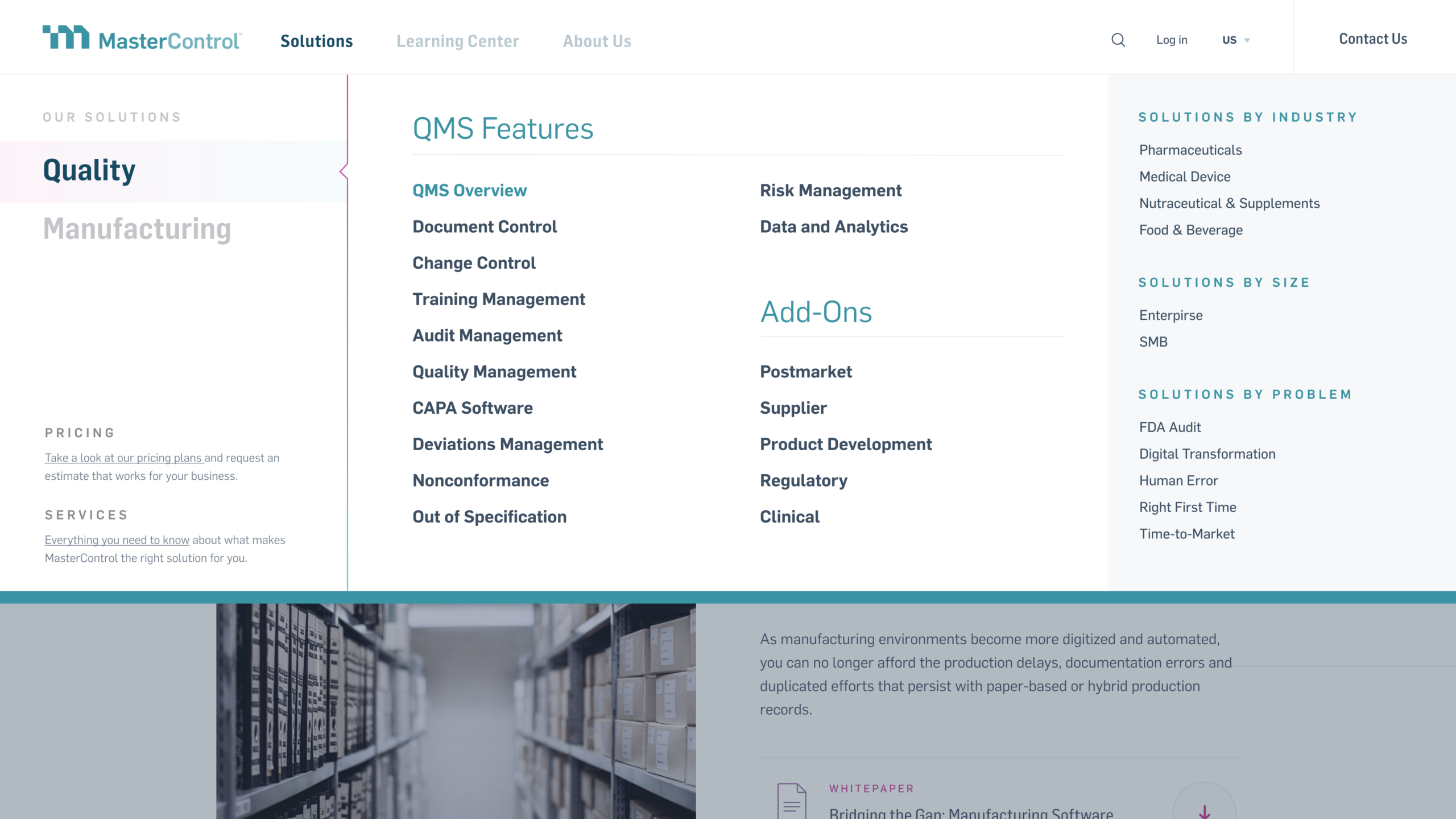
V-1.0 Update
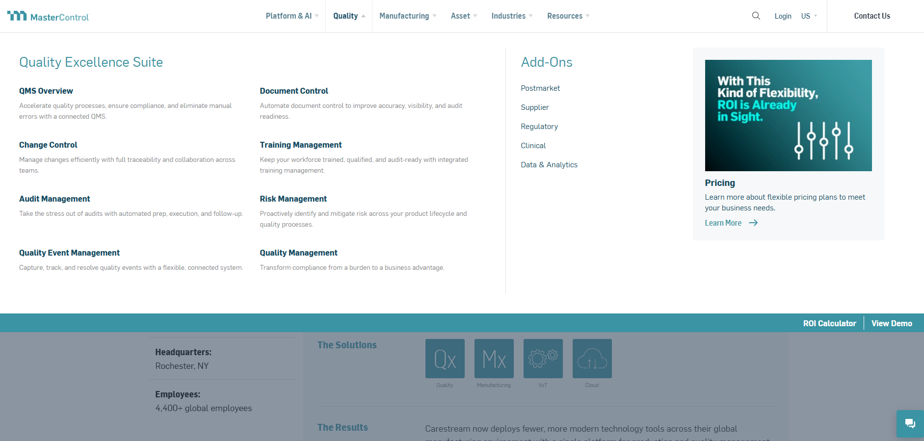
V-2.0 - Live Version
Let's build something great together.
Whether you’re looking for a designer, developer, or someone who can bridge the two, I’d love to hear about your next project.
Get In Touch