Luke Maynes Campaign Branding
Overview
Luke Maynes is running for office as a younger, progressive candidate with a focus on connecting with a broad range of voters. I partnered with Luke and his campaign team to create a bold, approachable visual identity and a flexible brand system that could evolve alongside the campaign as its messaging and outreach continued to grow.
Role
Brand Designer & Web Designer
Industry
Political Campaign
Timeline
Ongoing
Deliverables
Brand Identity, Website, Video, Photography, Social Media, Print Materials
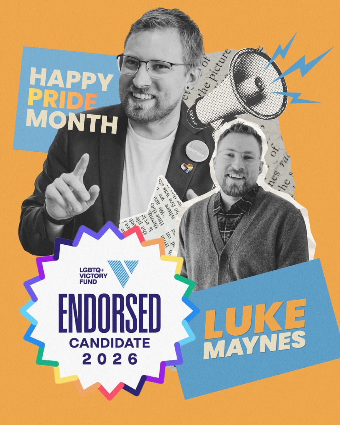
Social media Post
The Challenge
The campaign needed a visual identity that reflected Luke's progressive platform and energetic personality while remaining approachable to the moderate audience within his district. The brand needed to feel authentic, memorable, and flexible enough to support everything from digital outreach and fundraising to in-person campaign events.
Because the campaign was just getting started, the identity also needed room to evolve as messaging became more refined throughout the election cycle.
My Role
Working directly with Luke and his campaign team, I developed the campaign's visual identity from the ground up and applied it across every major touchpoint.
My responsibilities included:
- Brand strategy and visual direction
- Logo design
- Color palette and typography selection
- Campaign website design and development
- Portrait and Event Photography
- Launch video production
- Social media graphics
- Event flyers and printed campaign materials
- Ongoing brand expansion and creative support
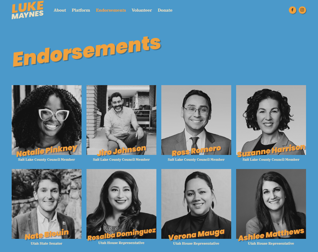
Keeping the branding consistent through the website
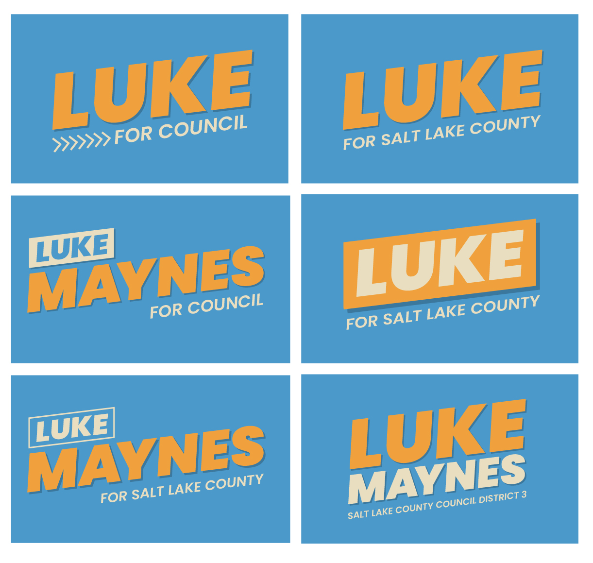
Logo options presented to campaign team
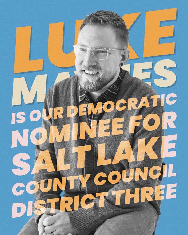
Social media post
The Process
The branding was inspired by the bold typography and layered textures often found in vintage protest posters, giving the campaign a sense of energy and authenticity while avoiding a look that felt overly aggressive or divisive.
Throughout the project, I worked closely with Luke and the campaign team to refine messaging and ensure every piece of creative reinforced the campaign's values and personality. As the campaign continues to grow, the brand has expanded alongside it, providing a consistent visual language across new marketing materials, events, and digital platforms.
The Solution
The result is a cohesive campaign identity that balances boldness with approachability, helping Luke stand out while remaining accessible to a diverse audience.
By establishing a flexible brand system rather than a single logo, the campaign can continue adapting its messaging while maintaining a recognizable and consistent presence across its website, social media, video content, and printed materials.
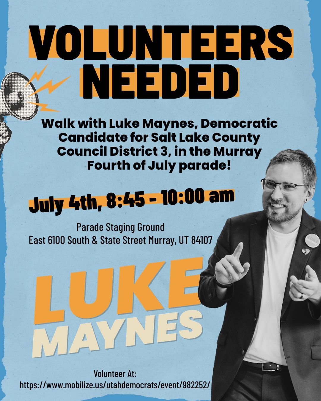
Event flyer
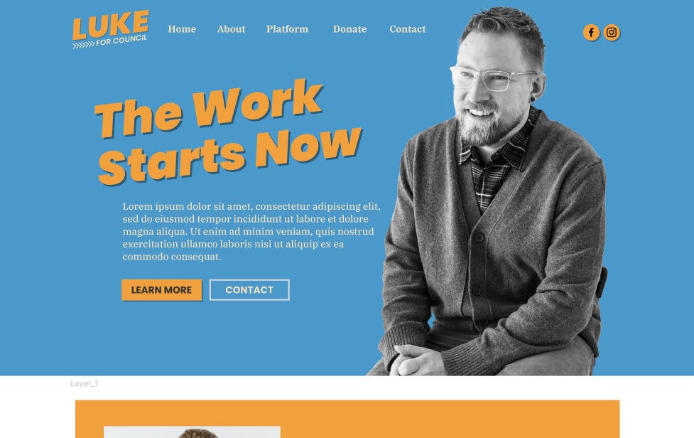
Website mockup
Let's build something great together.
Whether you’re looking for a designer, developer, or someone who can bridge the two, I’d love to hear about your next project.
Get In Touch